
TEMPLATE DOCUMENTATION
Read this page before making any changes to the template. Also, please register for our template restyle course:
*By the way, this page is pass-protected. You can just keep it in the Not Linked section and consult it when you need to
What's covered in this guide:
How to get started / Watch the course
Access CANVA graphics
Typography
Dropdown menu styling
Full-width buttons on mobile
1. How to get started / Watch the course
Firstly, duplicate all the pages you plan to use before making any changes to the design. This way you will save the original design of the layouts for your future reference. Many things can go wrong when you start designing, and some of them are difficult to reverse. Duplicating the pages beforehand will safeguard your customization process. If you mess something up, you can always start fresh. You can duplicate pages as many times as you need.
To duplicate a page click a small gear icon next to it. In the general settings scroll down and click Duplicate page. You can put these duplicated pages in the Not-Linked section, so no one sees them except for you. To do this, just click the name of the page and drag it down.


I also advise you to watch the course and prepare your content before tweaking the template. The course walks you through Squarespace website builder and explains how to customize your template using basic design principles. Watching it before jumping into tweaking ensures the best possible outcome.
Save sections to favorites
Go into the page editing mode and bring up the Edit Section menu in any section you like. Click the heart icon to save to the section to favorites, and then reuse it on any other page you like. You can access the saved sections when clicking “add section“ when editing the page.
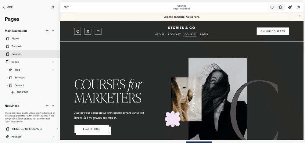
2. Access CANVA graphics
3. Typography
This snippet fine-tunes the headings and paragraph text styles across the site to create a more refined, editorial look. It establishes a balanced visual hierarchy:
Headlines feel light and elegant.
Subheads look structured and bold.
Decorative text adds personality and softness.
It’s a classic designer move for sites that want to mix modern editorial clarity with a touch of handcrafted charm.
One of the signature features of this template is a beautiful script font that adds a nonchalant atmosphere to the design because it looks like handwritten notes. This is a Bon Vivant font.
Important note: this is a custom font and it is not included with the template. To publish a website using this font, you need to buy your own license. We have bought it on Creative Market.
If you have a different handwritten font in mind, follow the first three steps of this tutorial on our blog to upload it to your website before coming back to this tutorial.
The snippet that is in charge of making the Bon Vivant font work on the website. In order to apply it select the text, set it to Heading 4, and make it italic. Voila! The text transforms into a handwritten scribble. It is not actually in italics as can you see. But we have CSS convert any bold Heading 4 to Bon Vivant font.
It is a bit counterintuitive, but we have to go this far because Squarespace doesn’t allow us to add any more font through the standard settings.
If you have uploaded another custom font to the website, swap the name of the font in this snippet. You are also free to tweak font size, font weight, line height, transform your text (e.g. make it uppercase), and even rotate it (right now it is rotated to -5 degrees).
// CUSTOM FONT - NOT INCLUDED WITH THE TEMPLATE, PLEASE BUY YOUR OWN LICINSE ON CREATVE MARKET

@font-face {
font-family: 'Bonvivant';
src: url(https://static1.squarespace.com/static/67aa364f4a53bf15ac29ea9c/t/67aa495dbb80597b5b42e1a9/1739213149606/bonvivant-regular.ttf);
}


// Typography

h1,h2,h3 {
  text-wrap: balance;
}

h2 strong {
  font-weight: 200;
  font-size: 4.4rem;
   line-height: 1.1;
}

p.sqsrte-large {
  text-wrap: pretty;
}

p.sqsrte-small strong {
  font-family: Almarai;
  text-transform: uppercase;
  font-weight: 600;
  line-height: 1.8;
  letter-spacing: 0.09em;
}

p.sqsrte-small em {
  font-family: "Bonvivant";
  font-size: 55px;
  font-weight: 300;
  line-height: 1.2;
  text-transform: none;
  display: block;
  transform: rotate(-5deg) !important;
  margin: auto;
  position: relative;
  font-weight: normal;
  letter-spacing: 0px;
}
We also use the new CSS text-wrap: balance property, which automatically balances line breaks in multi-line headings – making them more visually even and easier to read.
h1, h2, h3 {
  text-wrap: balance;
}
When part of an h2 is wrapped in <strong>, it becomes large, light, and elegant, giving a modern minimalist headline style — often used for hero sections or big intro titles.
h2 strong {
  font-weight: 200;
  font-size: 4.4rem;
  line-height: 1.1;
}
This part of the snippet applies text-wrap: pretty, another smart wrapping property that avoids awkward line breaks, keeping longer paragraphs tidy and aesthetically balanced.
p.sqsrte-large {
  text-wrap: pretty;
}
Small paragraph with bold text (used as subheads) create a clean, uppercase accent style for small subheadings – often used as section labels or “eyebrow” text. The font Almarai gives it a sleek, modern look with spacious letter spacing for readability.
p.sqsrte-small strong {
  font-family: Almarai;
  text-transform: uppercase;
  font-weight: 600;
  line-height: 1.8;
  letter-spacing: 0.09em;
}
4. Dropdown menu styling
Default Squarespace dropdowns can look tight or cramped, especially if you have multiple menu items. This CSS improves legibility and visual balance, making the navigation feel more refined and user-friendly.
//This changes line height and color in dropdown memu
.header-nav .header-nav-item--folder .header-nav-folder-content .header-nav-folder-item {
    line-height: 2.5;
    margin-left: 12px;
}

.header-nav-folder-content {
   background: #fff !important;
}
What it does:
Increases the line height of each dropdown link to
2.5, creating more breathing room between items.Adds a small left margin (12px) so each link is slightly indented, improving readability and visual hierarchy.
Sets the background color of the dropdown menu to white, ensuring the submenu stands out clearly from the main navigation bar or page background.
The
!importantmakes sure it overrides Squarespace’s built-in styles.
5. Full-width buttons on mobile
This snippet ensures that all buttons that aren’t center-aligned stretch to full width on mobile screens, improving usability and layout consistency. Mobile users benefit from large, easy-to-press buttons, especially for key actions like “Subscribe,” “Book Now,” or “Add to Cart.” This CSS ensures that all non-centered buttons follow that mobile-friendly full-width style automatically, without manually adjusting each one.
// Make all non-centered buttons full width on mobile
.sqs-block-button-container {
  &:not(.sqs-block-button-container--center) { //centered buttons are already, well, centered
    .sqs-block-button-element {
      @media only screen and (max-width: 767px) {
        width: 100%;
      }
    }
  }
}